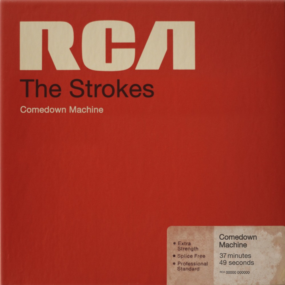
If the artwork for the Strokes’ fifth album, Comedown Machine, due March 26, looks straight out of music history, there’s a good reason for it: Philip Schiffman points out the cover is a Pop Art spin on old RCA magnetic tape case that recreates the text and sticker-like addition with precision.
“I love when stuff is a reclaimed object, in a sense that something tangible and real is turned into a design,” says Storey, who adds that using the tape case as inspiration also opens up a lot of potential for interesting packaging options.
Though the design obviously takes it cues from the past, opting to make the RCA name larger and more elaborate than the band name itself is a decision that runs counter to many modern covers. “The bold thing is the label, and it’s an interesting reference on the history of the label,” Carney says. “The life of it and the amount of time it’s been around is bigger than its parts.”
(RCA Records)

