


.Though the expression dictates that you can’t judge a book by it’s cover, that is precisely what movie studies hope you’ll do with their posters. Even if the movie is terrible, maybe you’ll shell out 13 dollars to see it anyway because the posters allow us to ignore reviews. We’ve decided to draw attention away from the actual film, and look for a moment at the posters of Summer 2013, and separate them by category, looking at good, and just as well, the bad.
.
.
And, now, without further ado…
.
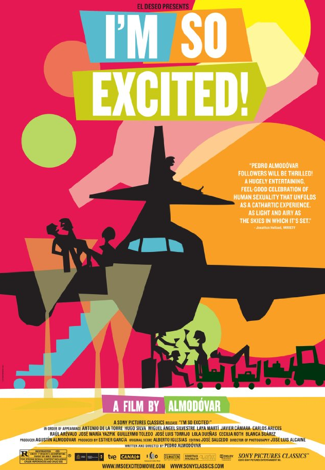
I’m So Excited
LOSER
Category: Weakest Saul Bass Imitation
Blocky graphic elements, spare type treatments, and color fields
are nothing without lots of wit and imagination.
.

The East
WINNER
Category: How to Best Convey the Idea that the
Movie Will Have Multiple Confusing Plot Lines.
We’re guessing, somehow, the stories of a woman, another woman,
and a man and a woman will overlap.
.
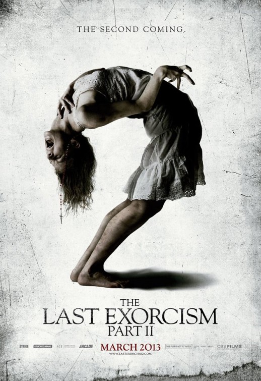
The Last Exorcism Part II
WINNER
Category: Best Reminder to See Your Chiropractor
We don’t even want to think of
what a Part III poster might look like.
.
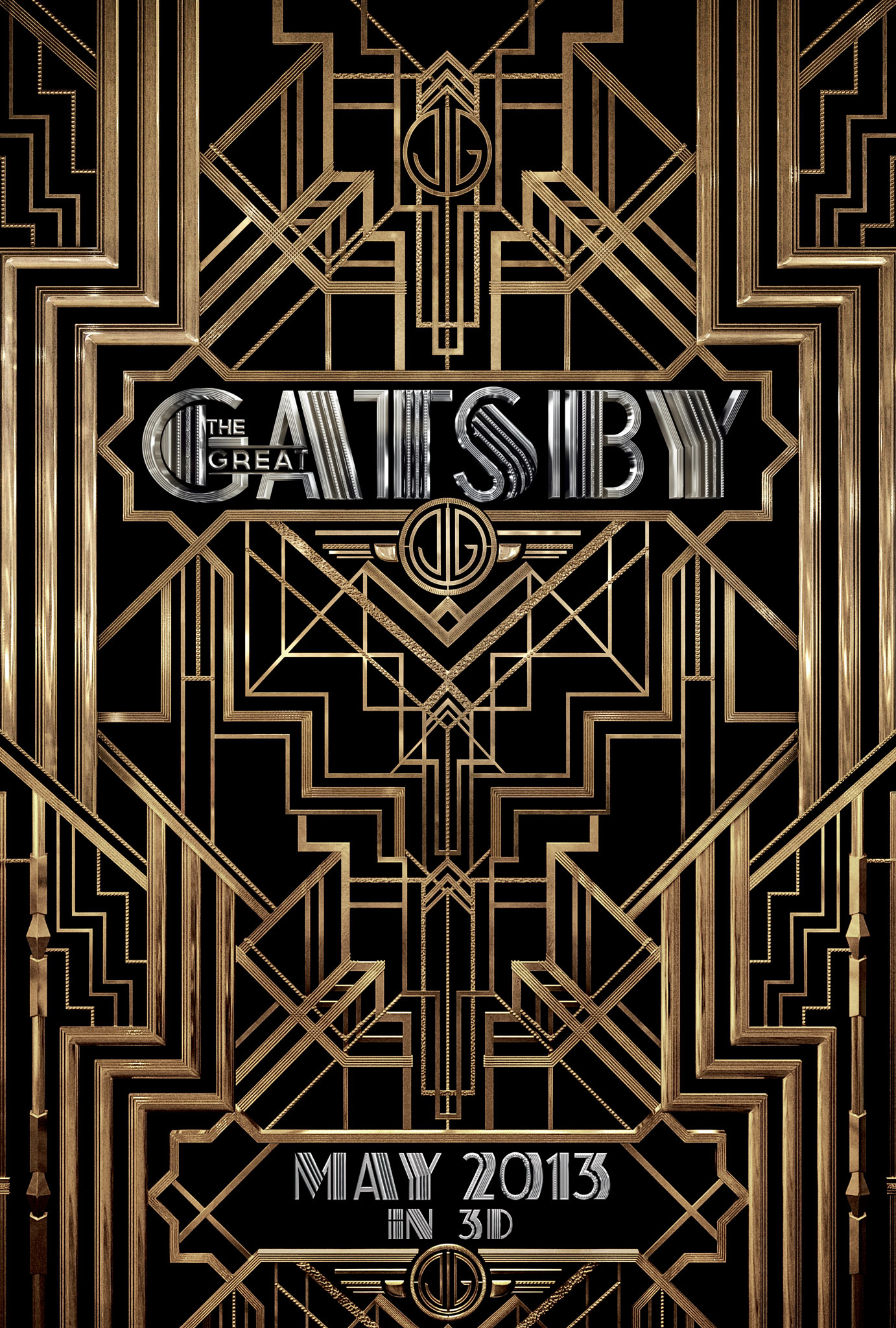
The Great Gatsby
LOSER
Category: Excess in Art Deco
In case you hadn’t figured it out,
this film takes place in the 1920s.
.
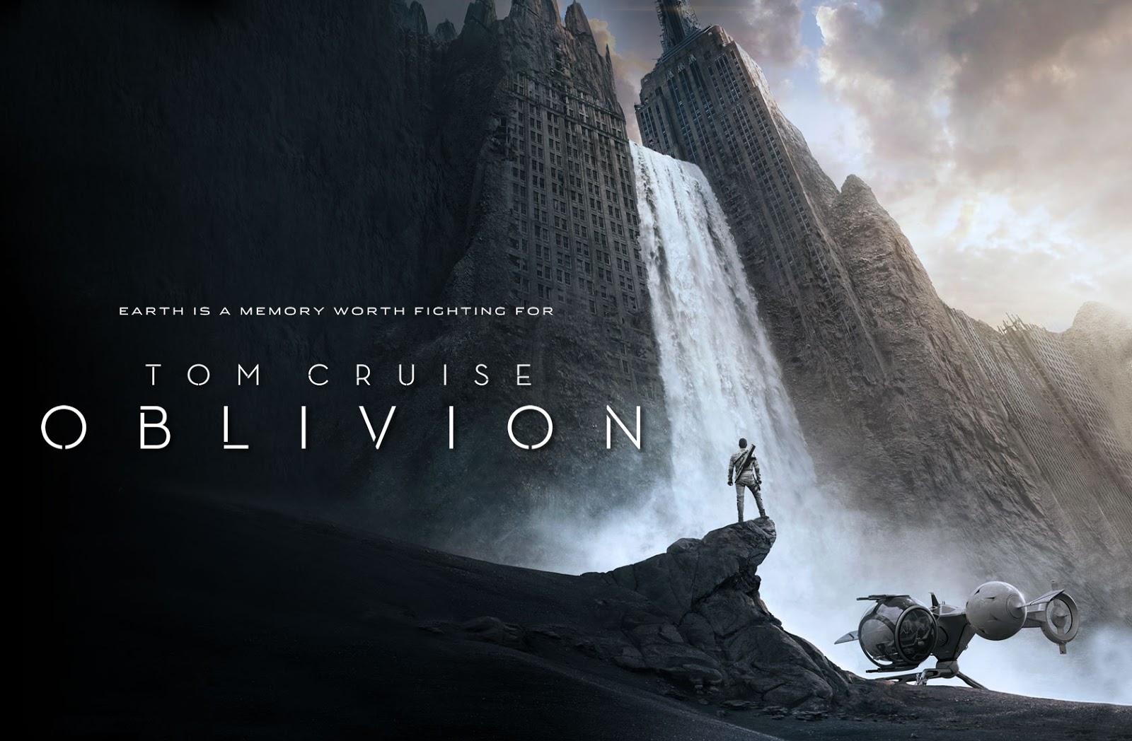
Oblivion
WINNER
Category: Least Objectionable Example of
Sole-Figure-on-Desolate-Landscape Concept
Still a studio favorite. And having Tom Cruise’s
form highlighted by the waterfall is nice.
.
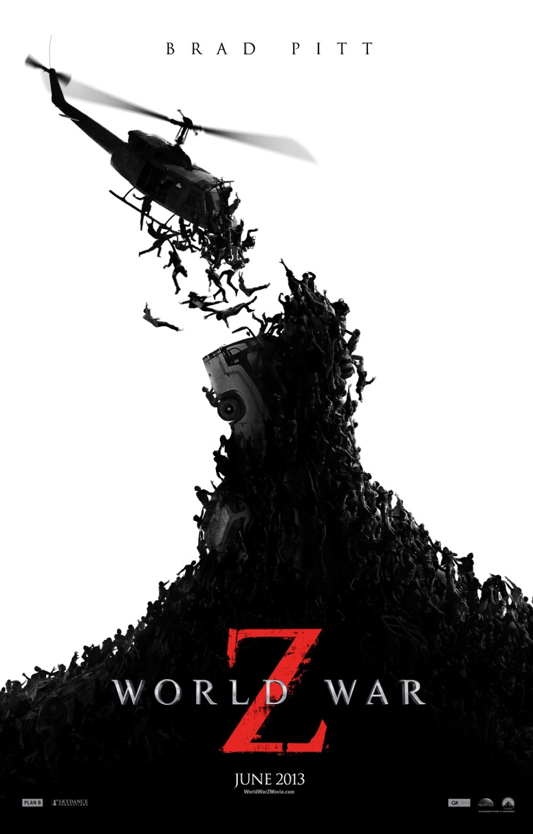
World War Z
WINNER
Category: Best Example of ‘Less is More’
Very Effective. We love how the zombies are
represented almost insect-like in their swarming fury.
.
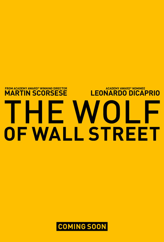
The Wolf of Wall Street
WINNER
Category: Best Urban Camouflage
It took us a few minutes before we realized it wasn’t
a 311 public-service announcement.
.
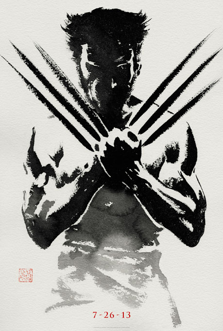
The Wolverine
LOSER
Category: Most Likely to Make Us Go ‘Wait, what?’
Even the release poster (this is the teaser) kept us
wondering: Where the &#$@ do those claws retract into?
.
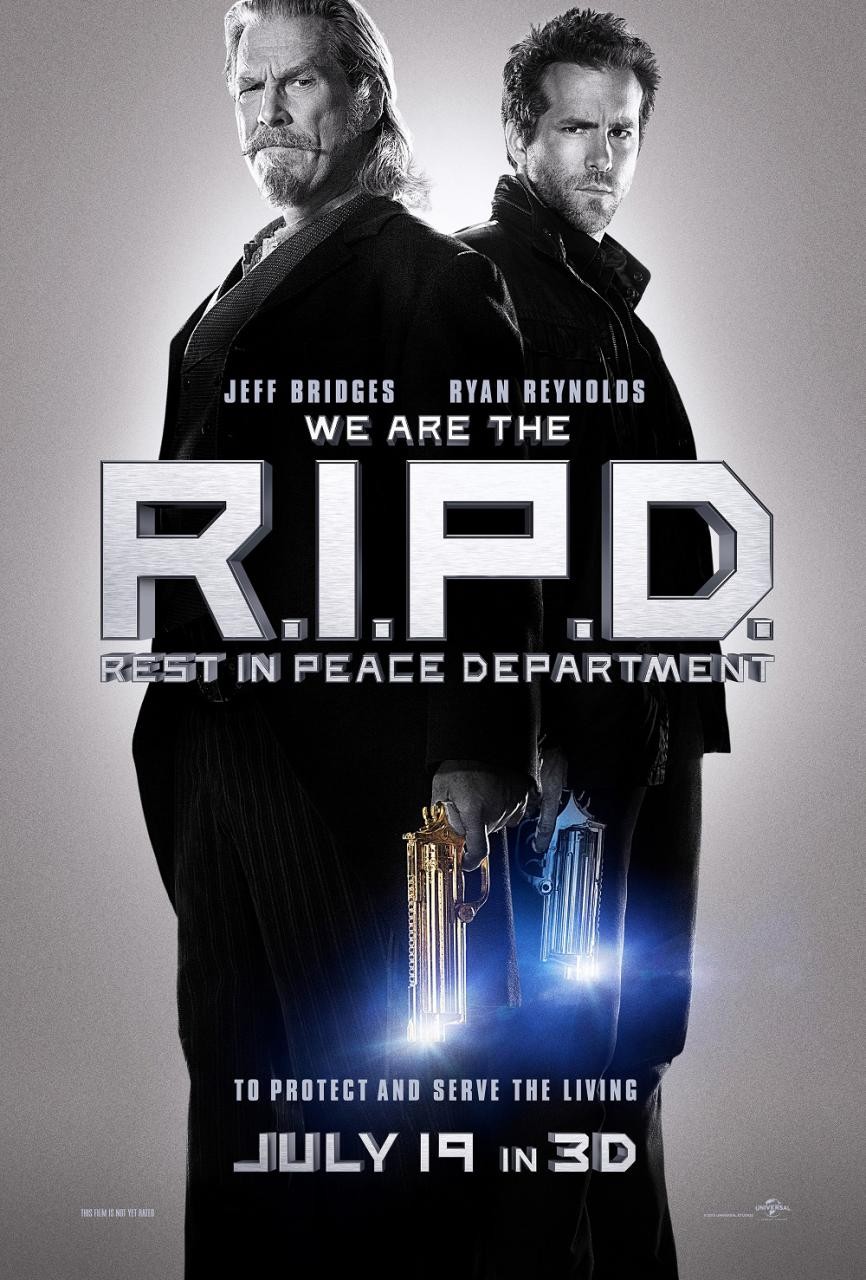
R.I.P.D.
LOSER
Category: Worst Example of ‘Just Show the Two Dudes!’ Concept
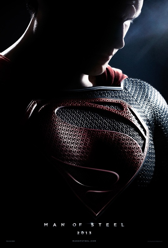
Man of Steel
WINNER
Category: Most Existential Depiction of a Superhero
Those relentlessly muted colors!