

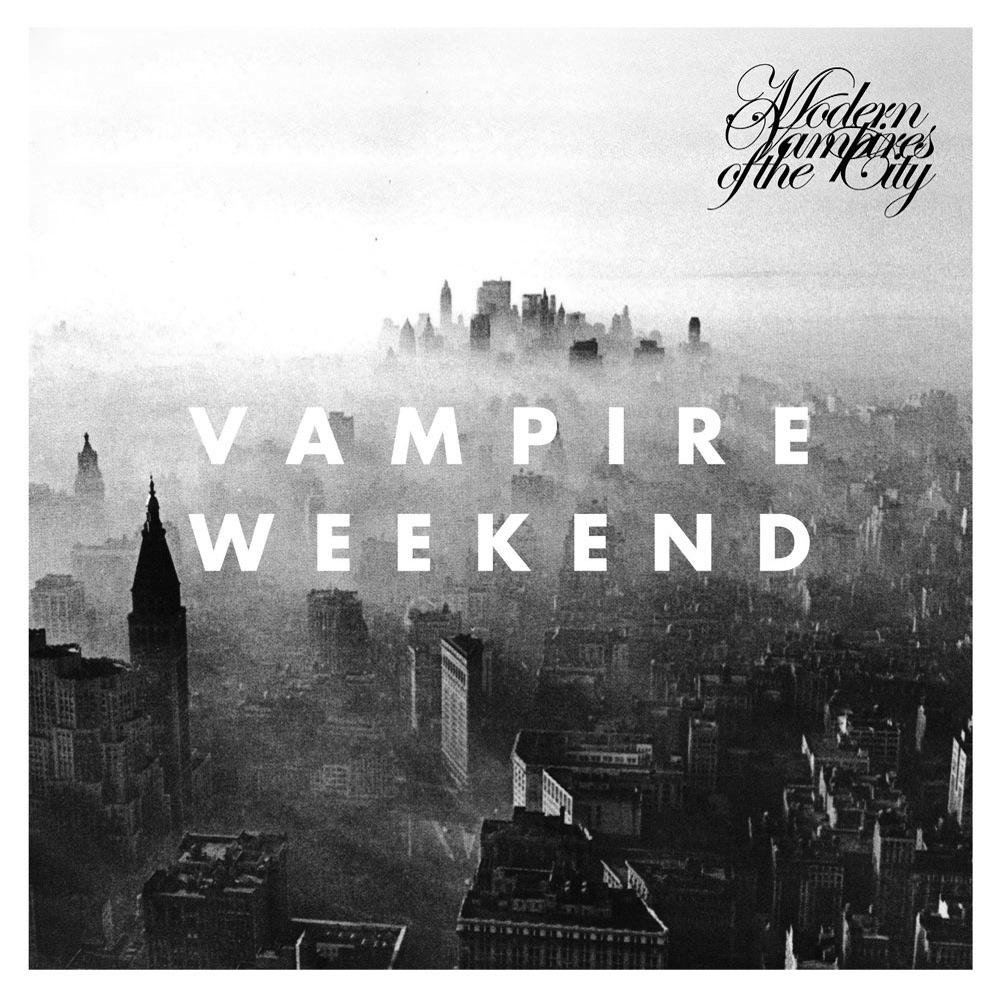
Throughout Vampire Weekend’s seven-year career, the New York quartet has maintained a consistent visual identity with their album art, complete with thick white borders, striking use of the Futura typeface and photographs that look like Instagrams before Instagram was ever cool. “It’s great when a band has a logo,” Storey says. “Sometimes really interesting things can come out of the framework when you know it’s got to look this way.”
But creating a cover like this one for Modern Vampires of the City, in stores May 6, is more than just slapping some text onto a pretty photo: Erin Schiffman says the placement of the logo and the title in relation to the black-and-white image is extremely well thought-out.
One departure from the clean lines of Vampire Weekend’s album-art history is the title script in the corner of the image. It’s a bit of chaos from the rest of the cover’s serene view, and Carney says it succeeds at delivering a visual shock to the viewer: “The script is a very interesting treatment, and it definitely makes me uncomfortable.”
(XL Recordings)