

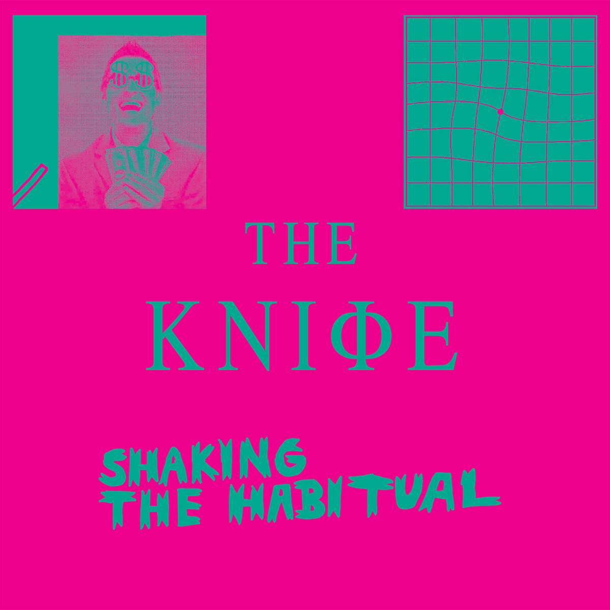
Don’t freak out if you’re having trouble staring at this vivid cover for more than a few seconds at a time — a clever application of color theory is tripping up your vision. “The colors scintillate,” Carney explains. “They’re the same values, but different hues. There’s no light and dark contrast, there’s only contrast between the colors. It makes the lines shake in your eyes.”
Though the Swedish band has won awards for its dark electronic music, The Knife picked an unexpected aesthetic for the Shaking the Habitual, due April 9. “I love that is has a real zine-like look to it, like it’s been photocopied or pasted together,” Storey says.
Philip Schiffman also picked up on low-budget, DIY vibe, saying it reminded him of punk and hardcore albums he’d buy as a kid. “We’re talking about really bad, Xeroxed albums,” he says. “It was a very low-tech look, but we had no other way to pick our albums, so we would just grab something that looked really off and hope it sounded pretty crazy.”
(Mute)